Gridform Development Update 2
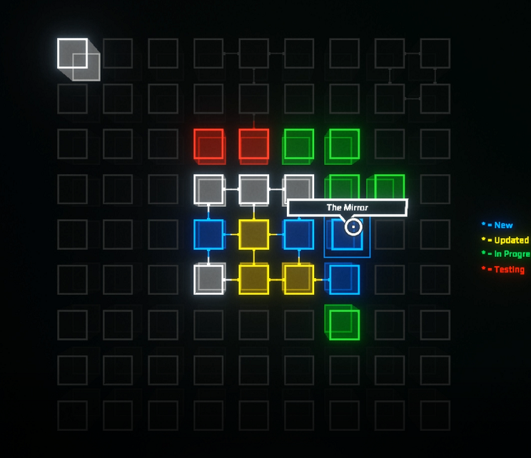
This week I worked on completely re-doing the level select screen for Gridform. The previous one was pretty boring and the code running it was pretty awful.

Old level select
Functionally the old one did what I needed, but just was not interesting enough to act as a center piece like I planned. My goal for the new version was to be both “more 3D”, and just more flashy in general. And....

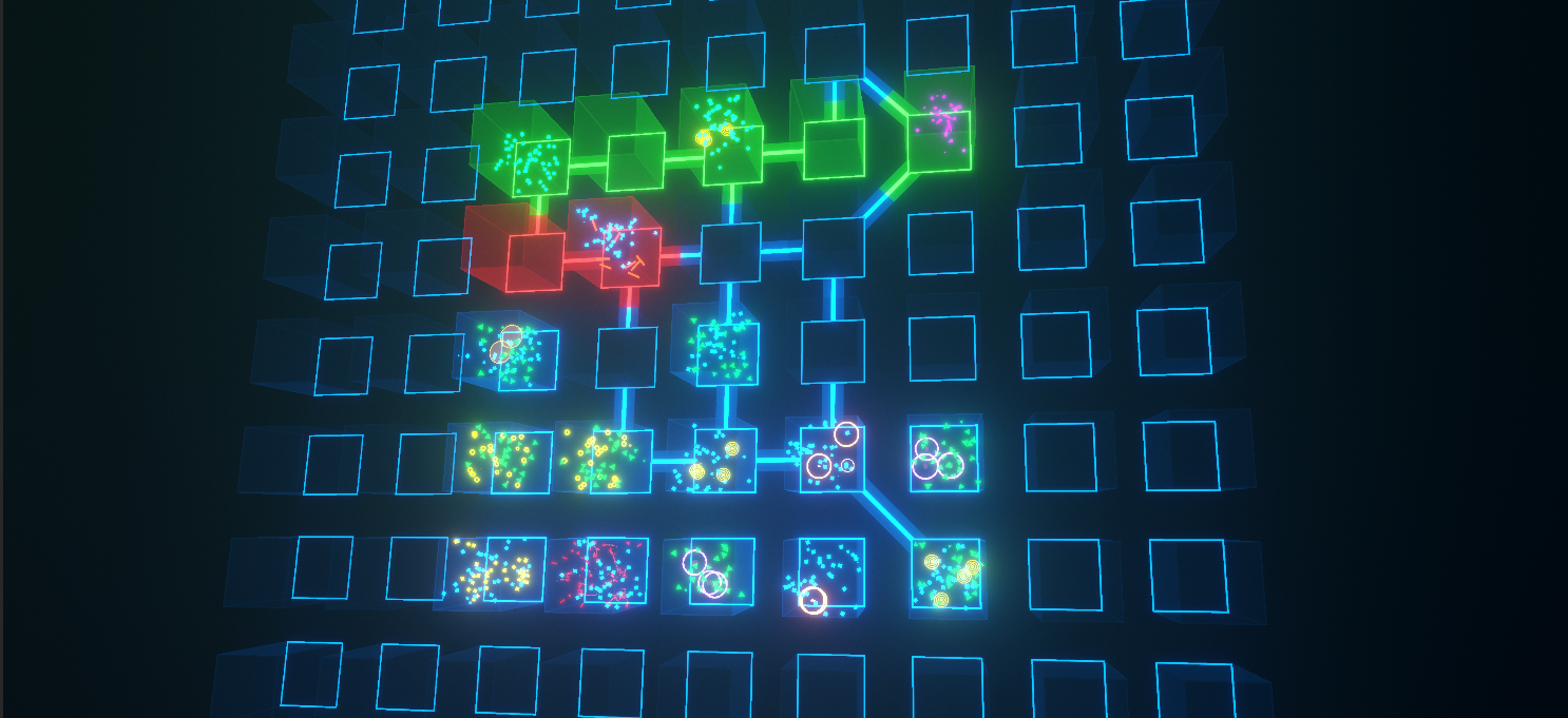
I think it turned out really well. Each level is a little "terrarium" containing particles representing the major enemies present in them. Additionally theres much more movement when you scroll through the levels adding a ton to the 3D feel of it.

Outside of the visual upgrade I can now make any sort of connection I want. Such as diagonals, where before I was restricted to cardinal directions. The old code for the buttons had some really lazy stuff that was running every frame so thats another easy win.
Overall I am super happy with how this turned out. It looks really great and still feels good to use. I still need to figure out how I am going to transition into levels once you select one. I want to fly the camera into the cubes, but doing that in such a way that doesnt strobe the screen can be tricky. We shall see...
If you are interested in the game join my discord: https://discord.gg/NHqsBw8nRv
Or follow me: https://twitter.com/AlanSherba
Gridform
More posts
- Gridform Particle TutorialMar 31, 2021
- Gridform Development Update 1Mar 24, 2021

Leave a comment
Log in with itch.io to leave a comment.